PROJECTS
Grace
Still Life
Bryson
Sophie
I chose to draw my friend Sophie for my colored pencil perspective drawing. I chose this picture because I liked the challenge of drawing a face in color. Two elements I used in this drawing were form and color. I used color since it was a colored pencil project. Overall, I did not like color very much. I used form to create the facial features such as the general face shape, mouth, and eyes. Two principles I used are balance and proportion/scale. I used balance to create the eyes. I used proportion when drawing the legs in comparison to the face; they were much smaller. This was the first time I have drawn a person in colored pencil, so it was a great challenge, but I probably would not do it again. My biggest challenge was getting all the shades of her skin tone.
Navy
I chose this photo because the soldier is very important to me. Two elements I used are color and line. I chose to make the soldier in black ink and use washes, but I chose to put the waving flag in color. I like how it turned out because it brought Nick, the soldier, out. I used line since I traced the original image. I like tracing because I feel like it made the final project more accurate and alike to the photo. The principles I used are movement and balance. I used movement in the flag since it was waving. I used balance in the face and in the Navy uniform. Overall, I like how my project turned out. It was difficult to use ink since it can not be erased. It was also difficult using washes since it is so easy to tear the paper with the brush.
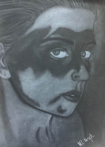
For my reflective drawing, I chose to draw a picture of one of my best friends, Hannah. I chose to draw Hannah since she means a lot to me and because of the shadow that was cast on her face. The shadow was the reflective part of my drawing. I also really liked this picture because of the depth; the foreground was in focus and the background was blurred. I used emphasis and contrast in this project. The emphasis was on her since the background was blurred. I also used contrast for the highlights and shadows. For example, her skin is lighter in the areas without the shadow over her face. I also used form and value. I really liked the outcome of this charcoal project because I thought it looks extremely realistic and very comparable to the actual photo.
|
I chose to draw a two point perspective hallway because I really liked the idea of the flag and picture frame. My grandfather was a part of the military, so whenever I see an American flag, I think of him, so I thought it would be neat to draw this corner. Two of the elements I used in this were color and line. I chose to draw this part of the school because I knew I would be able to incorporate a pop of color in the flag. Two principles of art I used in this drawing were balance and contrast. My project incorporates balance and line because all of the horizontal lines had to lead to a vanishing point. I used color and balance in the flag and in the Notre Dame logo to draw the eye to them. Overall, I am very satisfied with my hallway project and am happy that I chose this Notre Dame hallway.
|
I chose this area because I liked the shadows the lamps created on all of the surroundings when they were switched on. When looking through my view finder, I could see two lamp shades, a mannequin head with bunny ears, and a corner from some sort of frame. Two elements I used in this were value and space. Two principles I used were balance and contrast. I used space and balance to make sure everything was drawn to scale in the right location. I used contrast and value to create the light patches that the lamps left on the other objects. The hardest part of drawing this was doing the background. It was hard to differentiate the background from the objects since they were both bright when the lamps were on, so I had to shade the background more than I originally had thought.
|
|
|
|
